Let’s pretend you’re a project manager or co-owner of a construction company. You have 4 table saws to cut your lumber. Then one of your table saws breaks beyond repair. You notice that this causes you to fall behind on your lumber requests. When you tell the other owners, they respond that everything is fine and don’t believe it’s necessary to spend money on a new table saw.
You decide to setup a meeting with the owners and relevant managers. Your plan is to use a chart to show them how you’re falling behind of making lumber, due to the broken table saw. The idea is that if just talking to them doesn’t convince them there is a problem, that a visual of the problem will open their eyes to the situation.
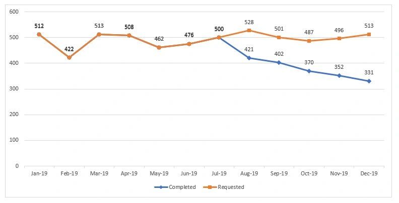
Using your data you create the chart below. This chart shows that the completed lumber is falling behind the requested lumber. However, the chart has too many data labels, most of the numbers are irrelevant. They can distract your audience from the numbers you want them to focus on. In this case the numbers from Aug-19 and later. Also, the labels for ‘Completed’ and ‘Requested’ are far away from the lines they are describing.
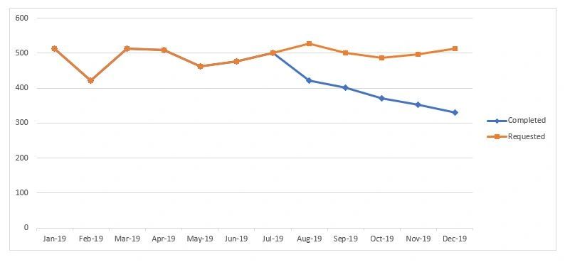
You make some changes as shown in the chart below. Removing the data labels helps your audience notice the gap forming after Jul-19. Also the line labels flow better. However they aren’t fully aligned with the lines they represent.
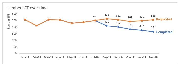
Most North American people view charts in a Z pattern. Starting from the top left, move across to the top right, then look diagonally to the bottom left, and finally across to the bottom right. You decide to use this knowledge to your advantage,
The chart displayed below is a great improvement. At the top left you’ve added the axis label for the Lumber LFT and a chart title. Your audience will likely look here first and this gives them the context of the chart. Next you’ve included the numbers you want the owners to focus on. With the line names aligned, your audience will right away see the problematic gap between the Requested Lumber and Completed Lumber. To really get your point across, that a new Table Saw needs to be purchased, you decide to make another improvement to your chart.
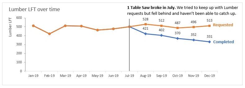
Here is your completed chart. You’ve added a short description of the situation. Now during your presentation, the owners will look at the chart and easily see that the 1 table saw breaking in July is causing the company to fall behind on lumber requests. This chart will compliment what you are saying during the presentation. It is less distracting and confusing as the previous charts, which will drive home your point that a new table saw needs to be purchased.
As you can see no matter what type of presentation you are doing, spending some time working on your charts or other data visualizations will greatly enhance the presentation and help convey the message your trying to get across.
If charts and graphs aren’t your thing, but you would like to improve your presentations, I can assist you. Either fill out the contact form on my website https://datasciencing.com or email me at peter.koebel@datasciencing.com.
Until next time, continue having data fun.