I was recently reading WinnipegREALTORS® excellent monthly report about the housing market of Winnipeg and its Metropolitan Region for April 2020, https://www.winnipegrealtors.ca/market-statistics/archived-market-releases/article/544/april-sees-a-slowdown-in-market-activity.
Near the end I came across this pie chart.
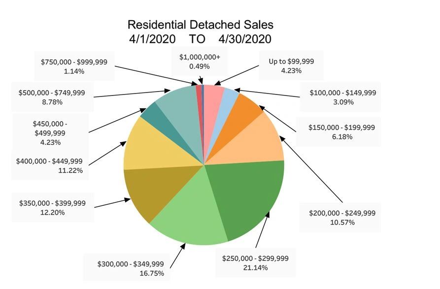
As this report is read my many different people, for a variety of reasons, its main purpose seems to be showing raw numbers. Also, the chart has to fit a confined space to fit in the report. I decided to tinker with it a bit and display the data differently for a specific purpose.
I noticed some of the pie chart slices that were next to each had similar colours. I decided to group those slices, in case someone wanted to see a summary of those groups. This produced the chart below. It helps summarize that the group of $250’000-$349’000 had the largest market share, followed by $350’000-$449’000, and $150’000-$249’000.
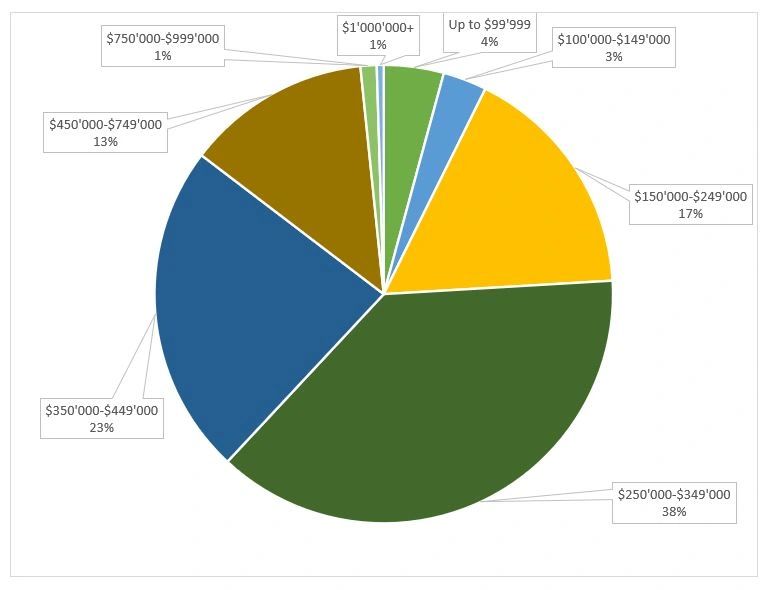
We could further combine neighbouring groups for a better summary. However, Pie Charts are best used to show that one slice is far larger than all the others combined. Let’s try a different chart to display our data and compare the different groups.
Imagine you’re a partner in a real estate company. You have space to show whatever chart you want, but you don’t have time to analyze all the nuanced values. Let’s design a chart that efficiently compares the groups.
We’ll start with a typical vertical bar chart.
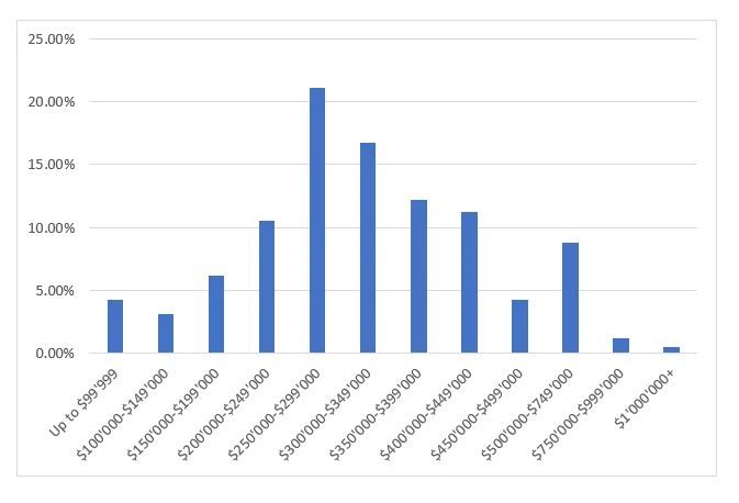
The main problem with this chart is that it is difficult to read the groupings. Since we can’t really improve the labelling of the groups, it’s not worth our time to work on this chart further. Let’s move on to another chart.
How about we try out a horizontal bar chart.
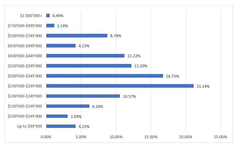
This looks a lot better. We can easily read the group labels. Plus, with seem work we could improve the efficiency of comparing the groups. However, there is one more chart we can investigate first.
Lastly, we’ll check out the funnel chart.
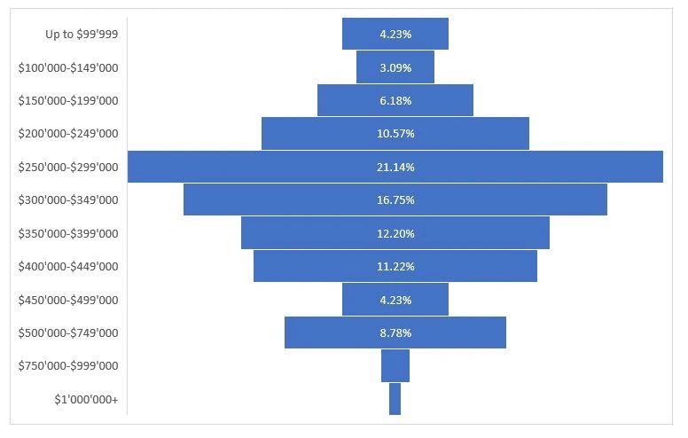
In many ways this is a “centered” vertical bar chart. I like the default settings better on the funnel chart, than the vertical bar chart. For the vertical bar chart, to be as efficient as the funnel chart, we would have to change the size of the bars. Then align the percentage values.
If you’re concerned that some categories aren’t showing their percentage values, remember we wanted to show an efficient comparison of the groups. Not the raw data. No percentage values shown, easily tells us that those groups are significantly smaller compared to the rest.
We can tweak and improve the funnel chart. Let me know in the comments, if you’d like me to show those improvements in a future blog.
Do you know someone that would like to improve their presentations, reports, and dashboards, but charts and graphs aren’t their thing? They can call me at 204-770-6437 or email me at peter.koebel@datasciencing.com.
Until next time, continue having data fun.