Let’s pretend you’re on the board of directors for a company (ABC Corp in this example) and are looking into potentially acquiring a competitor company (XYZ Corp). You and the other board of directors want to understand the impact this acquisition could have on your company’s overall sales, margins, and product categories.
We’ll be using a sample data set designed for educational purposes, any reference to real facts or real events is purely coincidental.
To summarize and interpret the data, we will create Data Visualizations in Tableau.
First let’s look at the top 5 product categories by sales for our company ABC Corp. We’ll set up the visual to be able to adjust the top number, in case someone wants to look at more of fewer than 5 product categories.
Here is what this looks like.
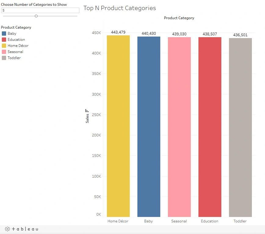
At the top left of this image, is the slider to choose the number of categories you want to see. Try it out on the interactive worksheet, in the link below.
Next we’ll compare the monthly seasonality of sales for our company and the company we are thinking of acquiring.
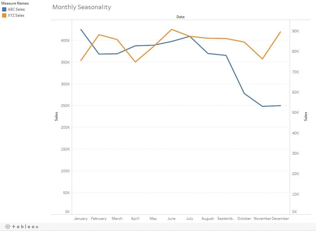
Here we can see that our sales can be quite sporadic. With a huge dip in the fall. Our competitor has more consistent sales. Plus, their dips and rises frequently compliment our own. This shows that acquiring this company will help us have more consistent sales and shouldn’t negate each other’s sales.
The you can view the worksheet at this link: https://public.tableau.com/profile/peter.koebel#!/vizhome/LetsHaveDataFunAnalyzingtheImpactofBuyingaCompetitor/MonthlySeasonality
Now let’s check out our sales by Province/State and the new total sales after the acquisition.
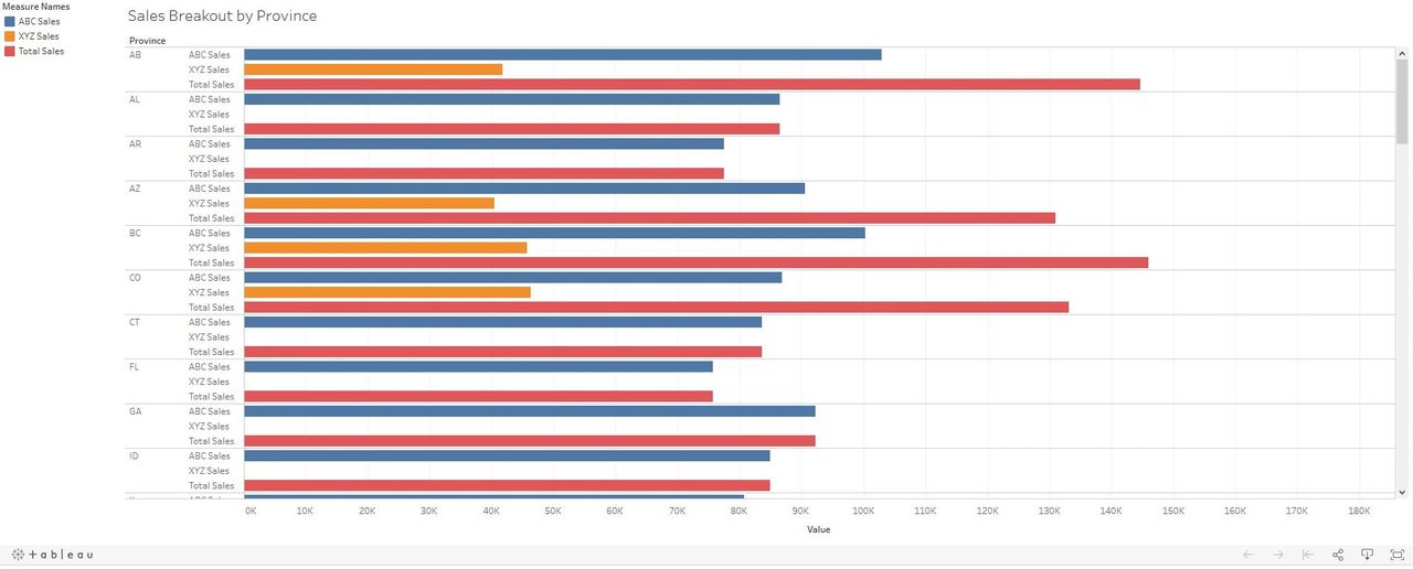
This visualization allows us to see the sales by province of our company, the competitor and what our expected sales will be after the acquisition. From the image above we noticed that out competitor does not sale their products in all the regions we do like Florida and Georgia.
Another benefit from this chart is that it allows us to easily see how much more our sales will be after the acquisition. By comparing the blue bars to the red bars, for each region.
To see the comparisons for all the regions, view the worksheet here: https://public.tableau.com/views/LetsHaveDataFunAnalyzingtheImpactofBuyingaCompetitor/SalesBreakoutbyProvince
Some members of the board are curious of what the % of total profit by region will be after the acquisition. For this visualization we will use a map.
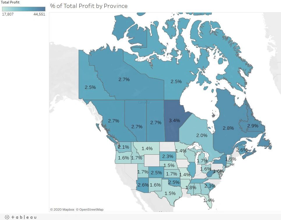
This map shows us the % of total profit by region. The darker the shade of blue, the higher the percentage. We can efficiently see that Manitoba has the highest percentage. With most of the other Canadian provinces and territories making up the next top spots.
To highlight certain regions, click on this link: https://public.tableau.com/profile/peter.koebel#!/vizhome/LetsHaveDataFunAnalyzingtheImpactofBuyingaCompetitor/ofTotalProfitbyProvince
Lastly, a few members of the board want to analyze the historical moving average of profit for the combined companies, using the previous two months and the next two months.
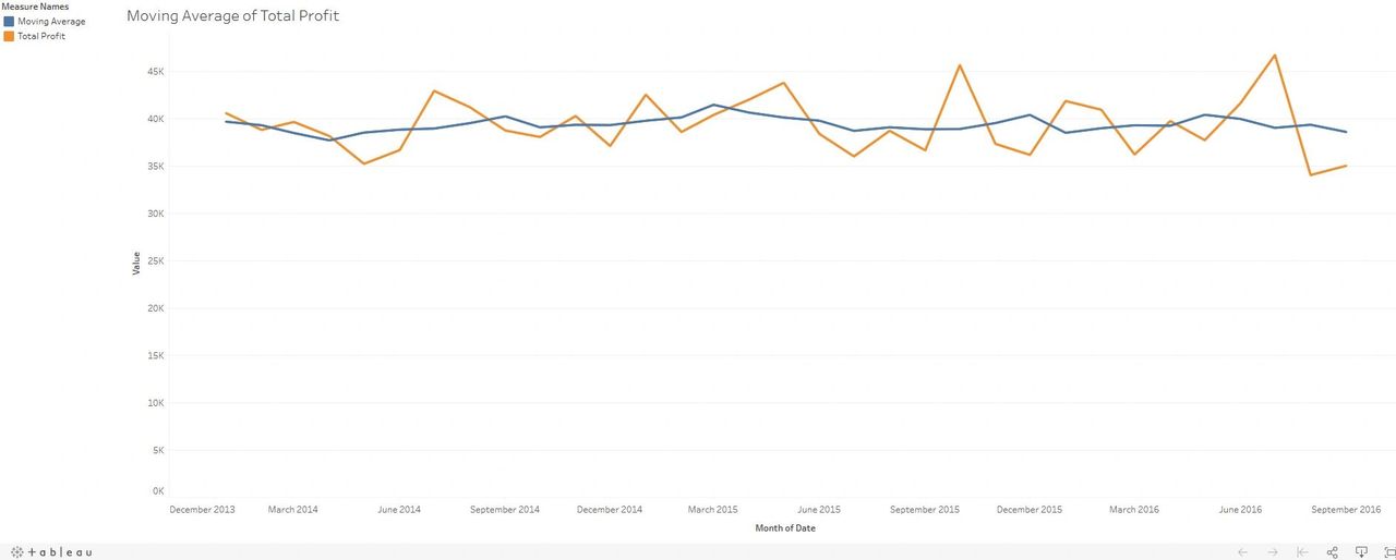
This display shows that the moving average of profit is fairly consistent.
To view the related worksheet check out this link: https://public.tableau.com/views/LetsHaveDataFunAnalyzingtheImpactofBuyingaCompetitor/MovingAverageofTotalProfit
As we explored with this example, even using some basic Tableau functionality you can greatly improve everyone’s understanding of your business’s data.
If you’re interested in knowing how to make these visuals, I will be making a video of how I created them.